
Who is behind the design of India’s news sites?
Posted : May 11, 2005 at 3:48 pm [America/Los_Angeles]
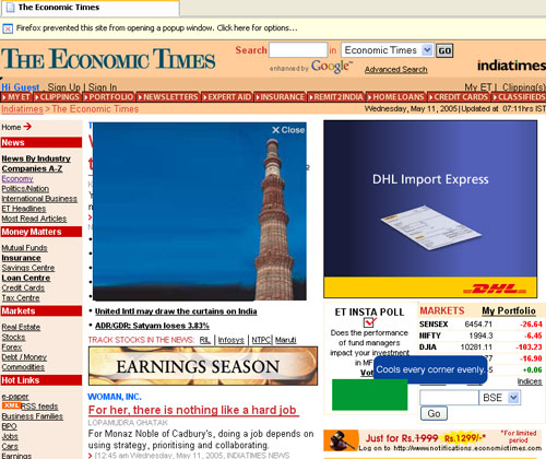
Economic Times
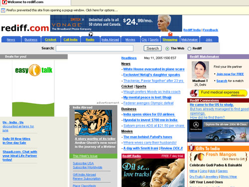
Rediff
I hate to pick on Economic Times and Rediff. The fact is, if you went looking for XHTML standards-compliant decent Indian News websites with quality content and end-user friendly UI, you will probably end up with not many (if any) .
Anyway, let’s start with Economic Times: As if the pop-ups (notice the Firefox message at the top notifying about it) and the stupid Flash pseudo pop-ups smackdab in the middle of the page (notice the navy blue square in the middle) were not enough, they’ve recently started with a new and extremely annoying online ad - basically, an ad that pivots around the position of your mouse cursor (notice the navy blue rectangle with rounded edges with the words “Cools every corner evenly” on it). The thing that makes matters worse is that the Flash pop-ups cannot be closed, atleast not in Firefox, by clicking on the ‘X’ symbol as advertised. Not to mention the fact that the curse of the “cursor-ad” haunts you everytime you visit the home page and you can’t do jack about it. Oh, and did I tell you about the bazillion “blinking” graphical ads splattered all over the site or the fact that you just can’t fetch any article in a “printer-friendly” format. And to think that the “print” edition” of the magazine is one of the (if not the) most popular financial newspaper of the country. Jeebus…
As for Rediff, I still remember the time when Rediff was hosted at rediff.co.in (and there was no rediff.com). I think it was 1996. I was at ASU doing my Masters and Rediff was definitely my favorite Indian news site. Alas, they too have fallen a prey to poor design and an insatiable desire to cram as many columns of annoying ads as possible. Result: You’ve more columns dedicated to ads on their homepage than to news headlines. Oh, and never mind the fact that there are ugly alignment issues in Firefox as shown in the screenshot above.
And that brings me to the one and only - “The Times of India”. Talk about having the most ideal name for a newspaper representing a country. And what do we get? Go look. Frankly, from the “looks” of it, thanks to the beautiful non-Indian (or non-Indian looking) damsels adorning the home page more often than I can count, it seems to have rightfully earned the moniker of “The Slimes of India”!
Bottomline: Economic Times is out. Business Standard is in.
- Anand
Category: Chindia
5 Comments
Totally agree!! Very low on content per page and very high on ads! On top of that extremely mozilla unfriendly sites!!
Also check out sulekha.com .. too many ads!
There definitely needs to be a clean and simple indian site!
-Mihir
http://weblog.sambhus.com
Posted by: Mihir Sambhus at May 12, 2005 @ 5:21 pm
Check out “www.desibakwas.com”. I stumpled on this site accidentally a few days back and provides feeds from a couple different news sites. The best part is no annoying ads and it is has a clean look.
Posted by: Sanjeev Kumar at May 17, 2005 @ 12:30 pm
Thanks Sanjeev! - Anand
Posted by: Anand Sharma at May 17, 2005 @ 12:35 pm
Wow, www.desibakwas.com is a wonderful site. It has what most of the people in US want to see on a web. Phone cards, deals sites to name a few. The news collection is really good as the sources are more than what samachar is offering.
Posted by: Sathish at May 26, 2005 @ 5:46 am
A decent news aggregator site I found recently was http://news.desihub.com. It has india related news in indian and international media ..
Posted by: Rahul Krishnan at May 27, 2005 @ 1:22 pm